

Inconsistent user experience across the platform and unclear advantages for junior students. Low web content accessibility rating and low user satisfaction scores.
Improving the legacy information architecture, designing mid-fidelity mockups, and creating a design system to ensure consistency and accessibility for different user groups. Handing off the designs with attention to color, typography, and accessibility. Improving the admin pages with better usability and a consistent visual style with the user-facing app.
User interviews were conducted to better understand the needs, challenges, and expectations of the target audience. This helped in identifying the gaps in the pre-existing design system and allowed for a more user-centered design approach.
Interviews revealed that users found it difficult to navigate the platform and often felt lost. They expressed a need for a clear and straightforward navigation system that would allow them to easily access the information and resources they needed.
Participants expressed frustration with the platform's low WCAG rating, which made it difficult for users with disabilities to access and use the platform. It was important for the team to prioritize accessibility in the design process to ensure that all users could have a positive experience.
Despite not having access to secondary users (investors), the team focused on understanding the needs of parents and their understanding of their children's needs. This allowed the team to design a solution that would meet the needs of both the students and their parents.
Competitive analysis was performed to understand the strengths and weaknesses of the existing solutions in the market, and how our product could differentiate itself and address the challenges we faced.

Using preliminary qualitative and quantitative data and user interview insights, we created a portrait of clients to ensure alignment during the design process.
Additionally, after gathering the necessary information from investment adviser interviews, stakeholder meetings, and competitive analysis, two critical questions arose that assisted us in brainstorming and wireframing potential solutions.
Before jumping into wireframing, I mapped the legacy IA to understand the platform and where it was falling behind to map out the new and improved information architecture.

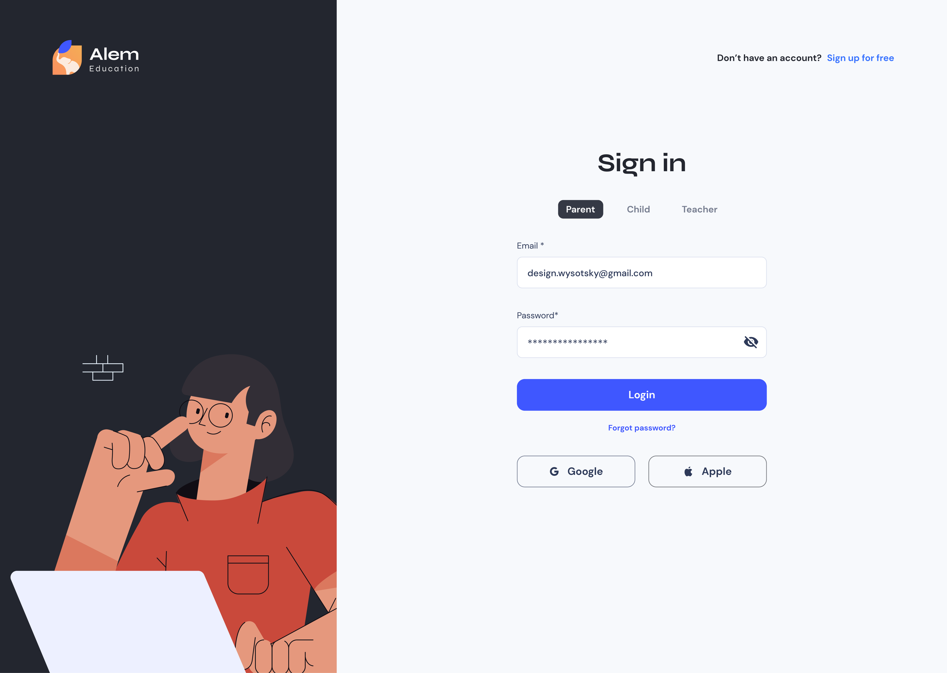
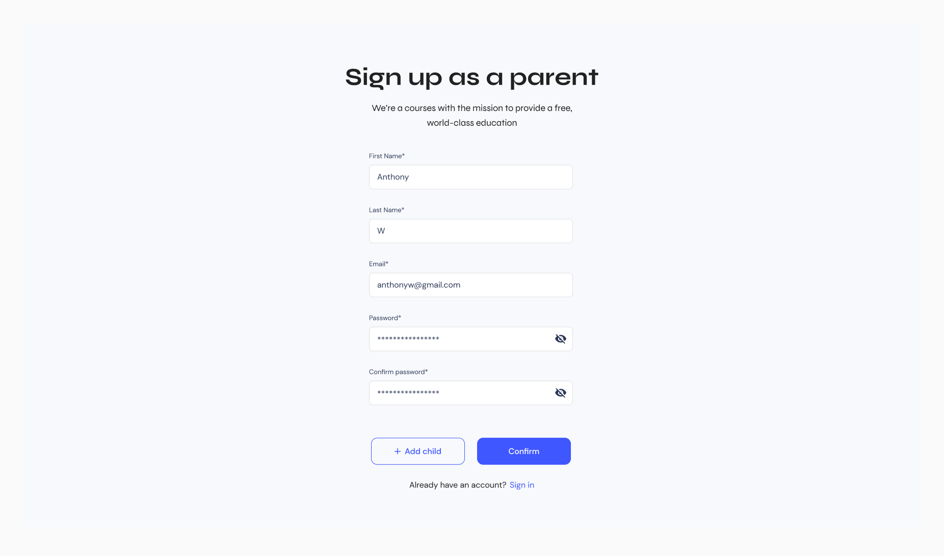
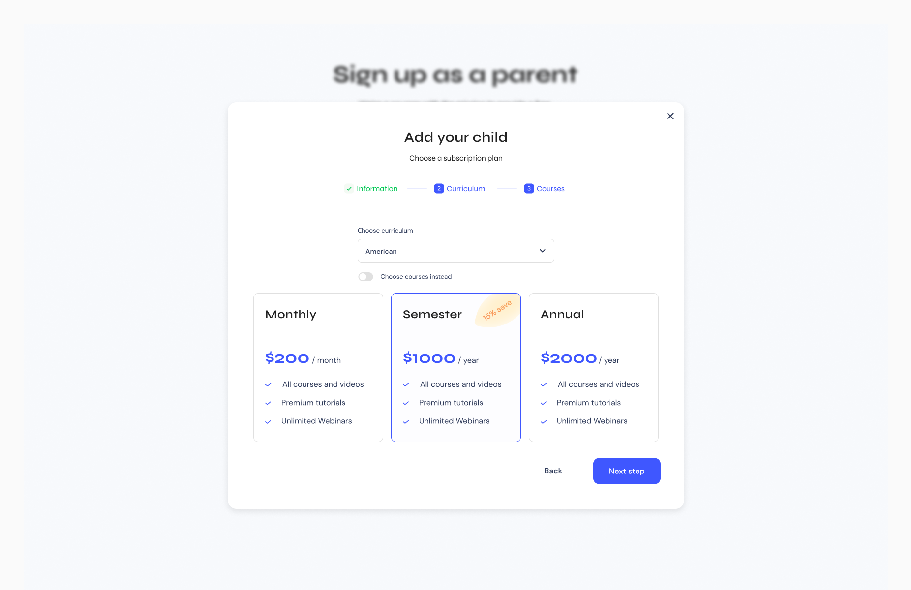
I made the decision to create mid-fidelity mockups right away rather than starting with low-fidelity mockups. There were a few reasons for this decision.
Firstly, the project stakeholders had a clear vision of what they wanted the final product to look like, and low-fidelity mockups would not have accurately represented their vision. I felt that it was important to start with mockups that were closer to the final design in order to effectively communicate the design to the development team and stakeholders.
Additionally, the project required a higher level of detail in order to be effectively communicated to the development team and stakeholders. Low-fidelity mockups would not have provided enough detail, and I felt that it was important to create mid-fidelity mockups in order to effectively communicate the design.
Finally, the project was time-sensitive, and I felt that starting with low-fidelity mockups would have taken too long. I made the decision to start with mid-fidelity mockups in order to save time and stay on schedule.

We came up with our final designs for the platform after resolving any outstanding issues such as diverging opinions or usability issues.
.png)
Color accessibility enables people with visual impairments or color vision deficiencies to interact with digital experiences in the same way as their non-visually-impaired counterparts.
The elephant has the largest brain of all land animals, as well as a very good memory. That's why it symbolizes the educational platform the best.
.png)
By paying attention to the details and structure of the project, a design system was created that covers all user scenarios.
The biggest challenge was to make UI consistent and accessible for different user groups: students, parents, teachers and admins.
.png)


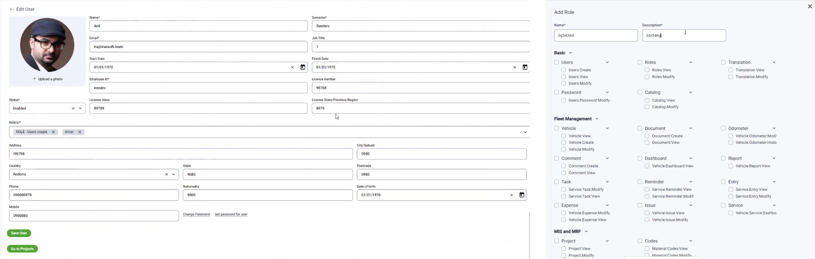
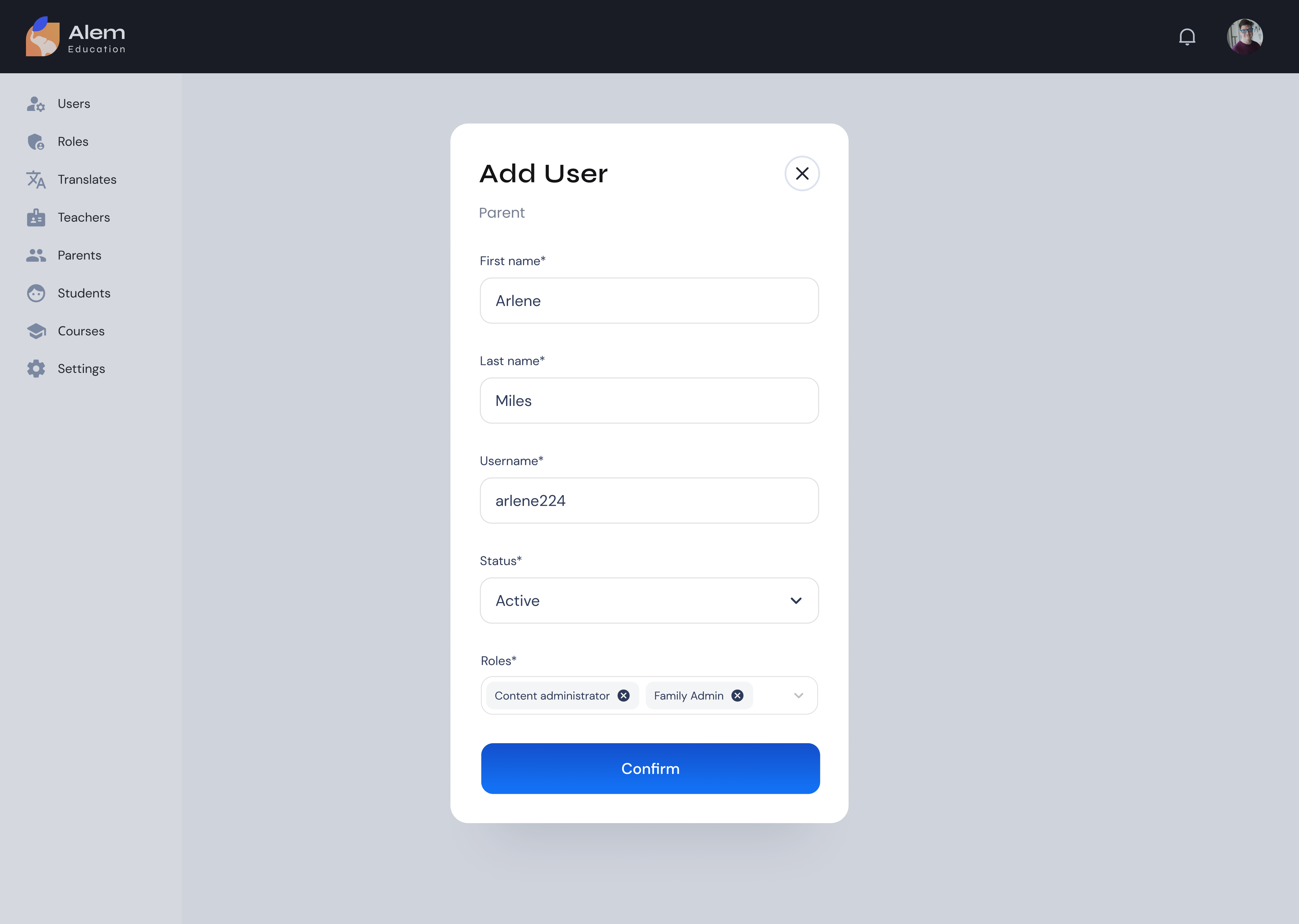
The problem: The platform's admin pages were suffering from poor usability and a lack of visual consistency with the user-facing app. They were cluttered with information, making it difficult for administrators to find the tools they needed quickly. Additionally, the visual style of the admin pages was outdated and did not match the aesthetic of the user-facing app, causing confusion and a lack of trust in the platform.
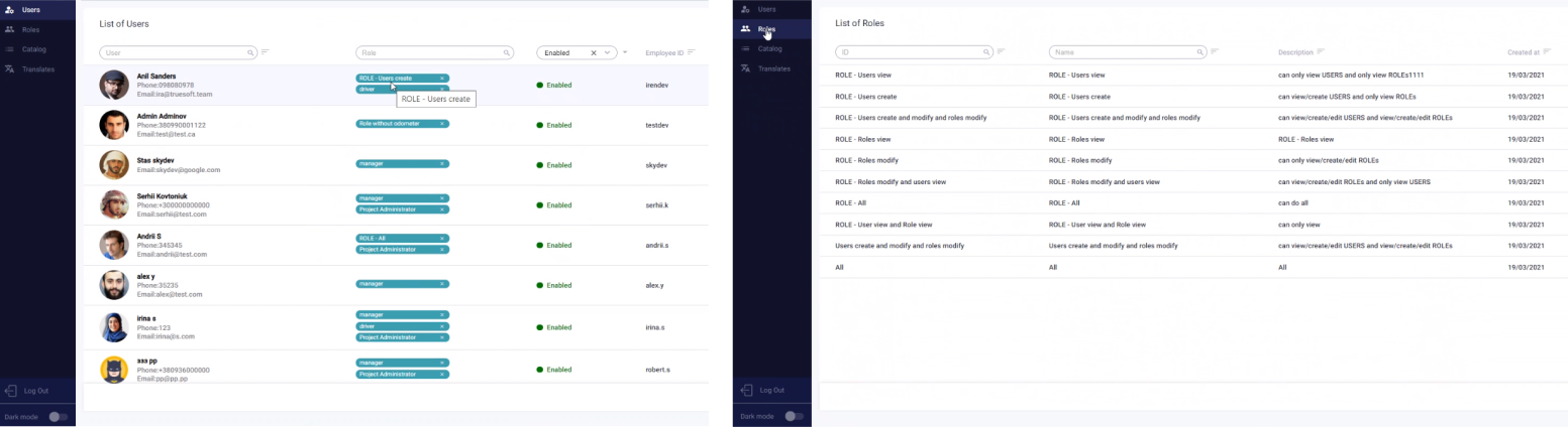
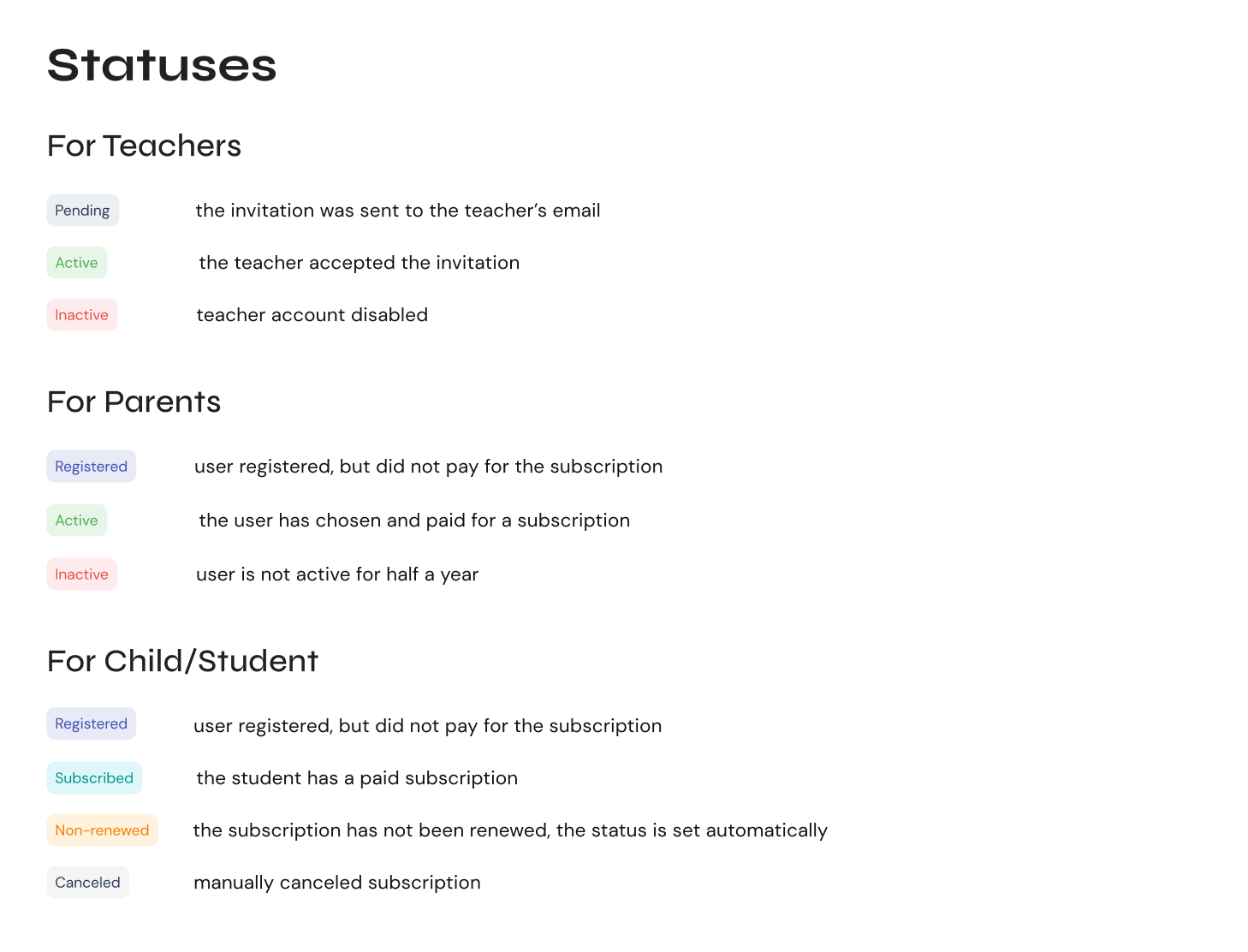
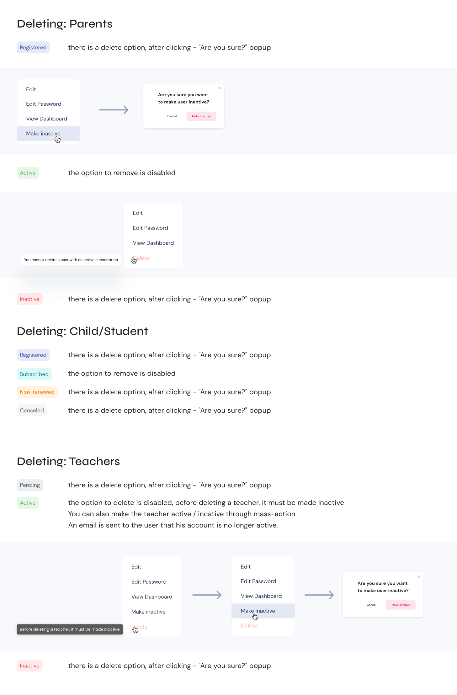
The solution: To solve these issues, the design team introduced status rules for different roles of users, which allowed us to limit access to certain sections of the platform. Additionally, we changed the information architecture structure to simplify and make it more intuitive for the administrators. By removing unnecessary information and grouping tools into clear categories, we made it easier for administrators to find what they need, thus improving the usability of the platform.
and updated the visual style of the admin pages to match the aesthetic of the user-facing app. This helped to create a cohesive and consistent look and feel across the platform, which improved the overall user experience and increased trust in the platform.

Admin popups
Notifications
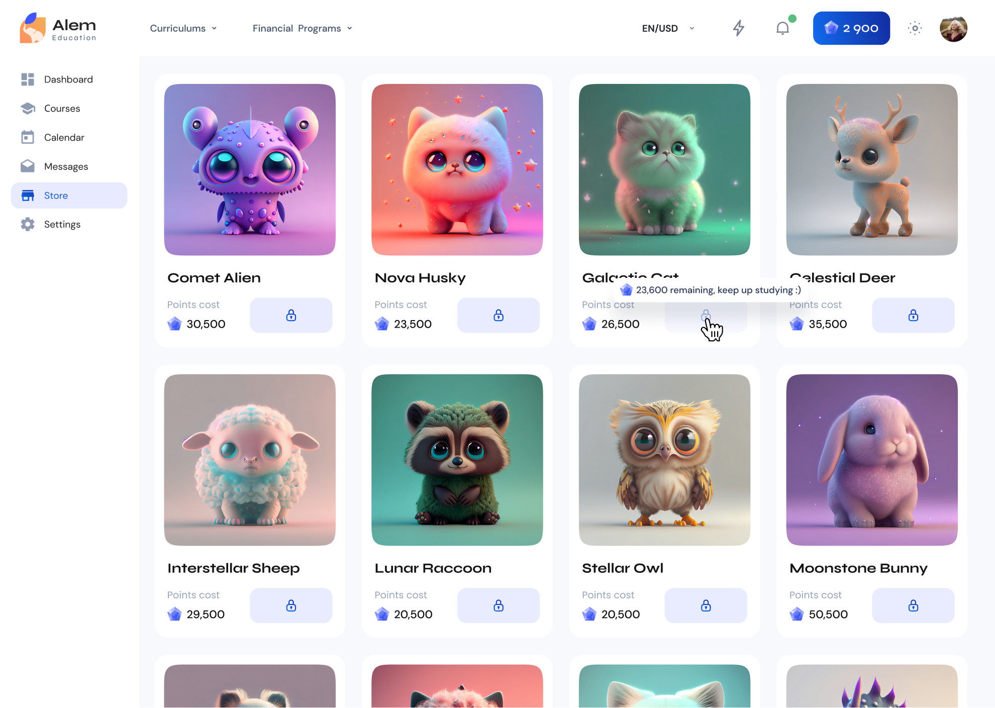
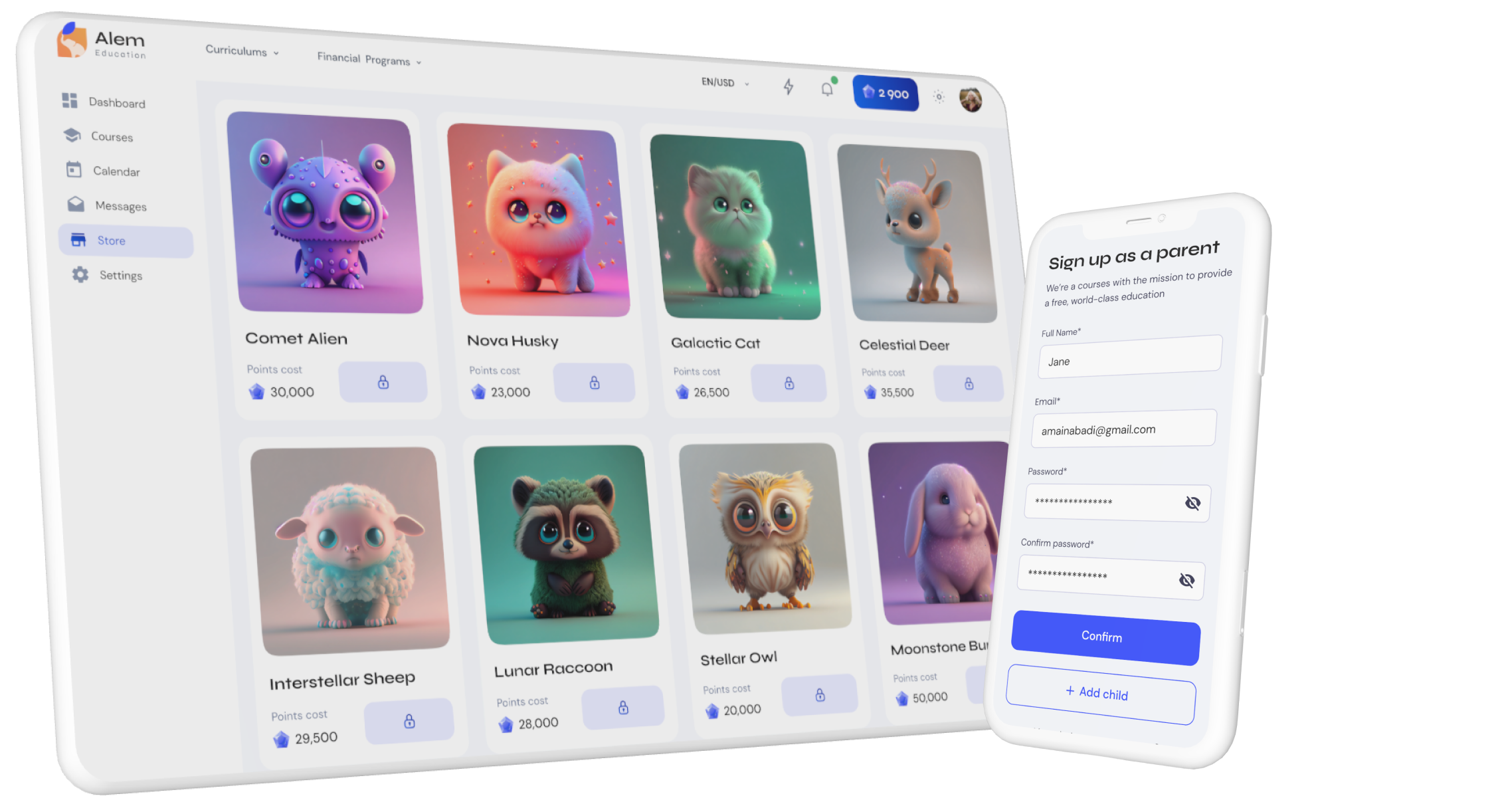
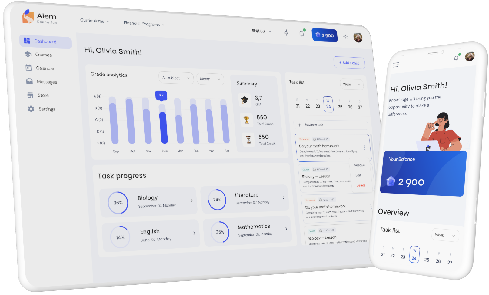
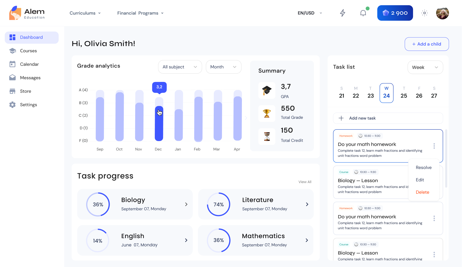
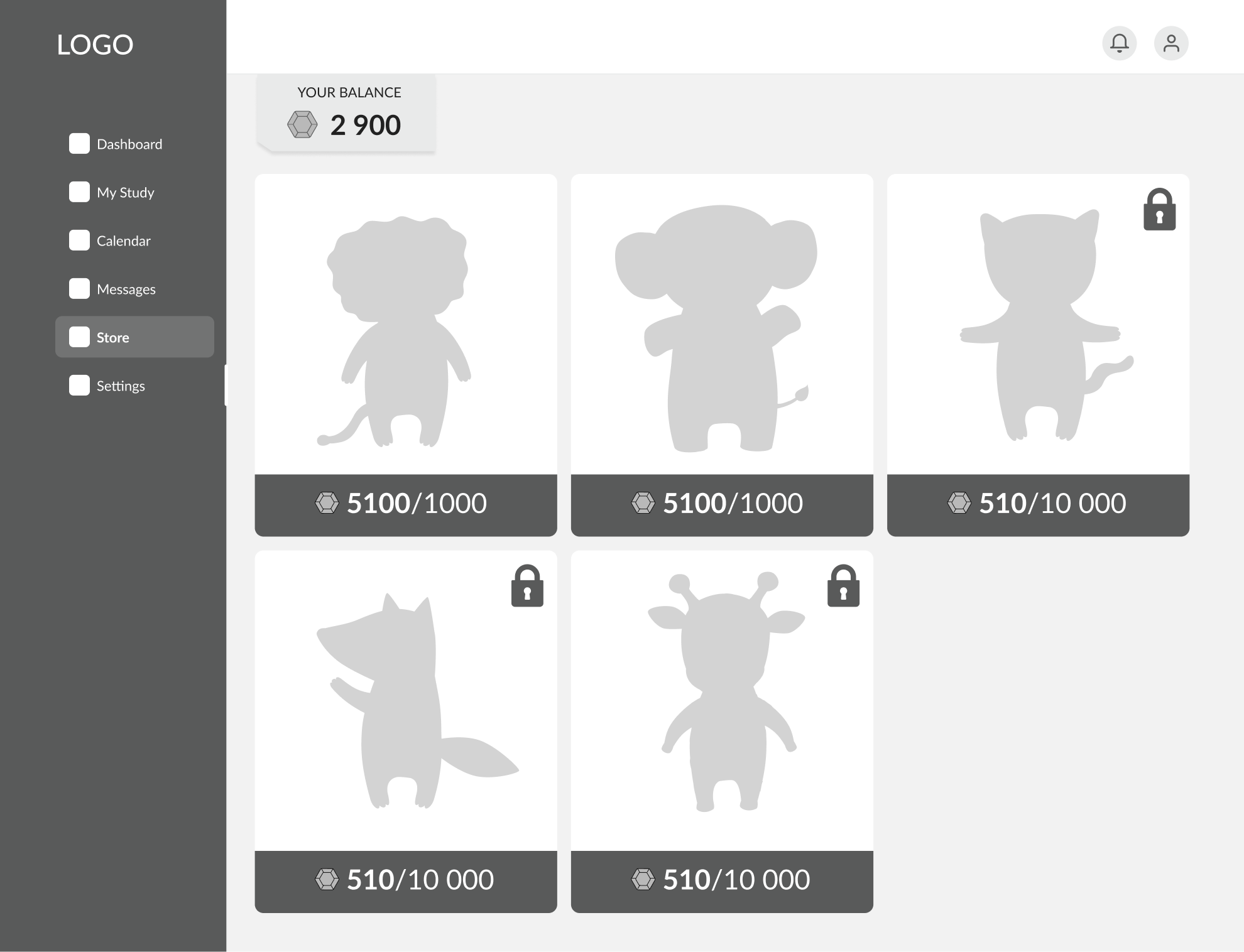
In our e-learning app, targeting primary and secondary school students, we added gamification to enhance the learning experience.
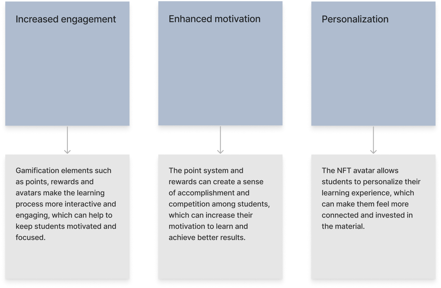
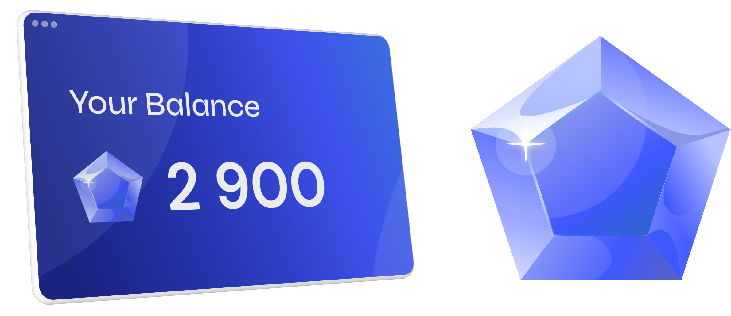
The points could then be exchanged for a 3D character avatar, which was an NFT (non-fungible token) character. This avatar provided a percentage off for certain courses as an added incentive for students to continue learning and earning points: